
CSS
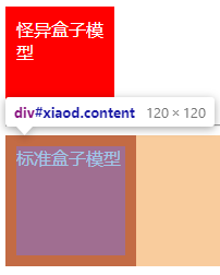
盒子模型

盒模型本质上是一个盒子,封装周围的 HTML 元素,它包括:margin、border、padding、content(width、height)
盒子模型分两种:标准盒子模型、怪异盒子模型。
标准盒子模型
1# 模型成员
2	margin、border、padding、content
3
4# content不包含其他成员
怪异盒子模型(IE 盒子模型)
1# 模型成员
2	margin、border、padding、content
3
4# content不包含(设置的宽高不会被border和padding所影响)
5	border、padding
改变元素的盒子模型类型
1标准盒子模型:box-sizing:content-box;
2怪异盒子模型:box-sizing:border-box;
盒子模型演示
 1<!DOCTYPE html>
 2<html>
 3<head>
 4	<title>盒子模型演示</title>
 5	<style type="text/css">
 6		.content{
 7			width: 100px;
 8			height: 100px;
 9			background: red;
10			color: #fff;
11			padding: 10px;
12		}
13		#tim{
14			box-sizing: border-box;
15		}
16	</style>
17</head>
18<body>
19	<div class="content" id="tim">怪异盒子模型</div>
20	<hr/>
21	<div class="content" id="xiaod">标准盒子模型</div>
22</body>
23</html>


CSS 选择器的权重计算
谁优先级高用谁的样式
1第一优先级:无条件优先的属性只需要在属性后面使用!important。它会覆盖页面内任何位置定义的元素样式。
2第二优先级:在html中给元素标签加style,即内联样式。该方法会造成css难以管理,尽量少用。
3第三优先级:由一个或多个id选择器来定义。例如,#id{margin:0;}会覆盖.classname{margin:3px}
4第四优先级:由一个或多个类选择器、属性选择器、伪类选择器定义。如.classname{margin:3px}会覆盖div{margin:6px;}
5第五优先级:由一个或多个类型选择器定义。如div{marigin:6px;}覆盖*{margin:10px;}
6第六优先级:通配选择器,如*{marigin:6px;}
权重计算值分级
如果遇到样式冲突了,你想设置的样式不起作用时可以利用上述知识提高优先级,增加其权重。
1第一等级:代表内联样式,如style="",权值为 1000
2第二等级:代表id选择器,如#content,权值为100
3第三等级:代表类,伪类和属性选择器,如.content,权值为10
4第四等级:代表标签选择器和伪元素选择器,如div p,权值为1
选择器权重演示
 1<!DOCTYPE html>
 2<html>
 3<head>
 4	<meta charset="utf-8">
 5	<title>样式权重计算</title>
 6	<style type="text/css">
 7		/*通配符选择器,优先级最低*/
 8		*{
 9			width: 100px;
10			height: 100px;
11			background: red;
12		}
13		/*标签选择器,优先级比通配符选择器高,比类选择器优先级低*/
14		body,html{
15			background: #fff;
16		}
17		div{
18			background: black!important;
19		}
20		/*类选择器,优先级比标签选择器高,比id选择器低*/
21		.tim{
22			background: yellow;
23		}
24		#xiaod{
25			background: green;
26		}
27	</style>
28</head>
29<body>
30	<div class="tim" id="xiaod" style="background:blue;"></div>
31</body>
32</html>
CSS 常见样式属性
 1* height	设置高度
 2* width		设置宽度
 3* padding	设置内边距(可以设置1~4个值)
 4	padding:10px;		所有四个填充都是 10px
 5	padding:10px 5px;	上下填充10px;左右填充5px
 6	padding:10px 5px 15px;	上填充10px,左右填充5px,下填充15px。
 7	padding:10px 5px 15px 20px;	上填充10px,右填充5px,下填充15px,左填充20px。
 8* margin	设置外边距
 9* border	设置边框
10* color		设置字体颜色
11* background	设置背景颜色
12* font-size	设置字体大小
CSS 常见属性演示
 1<!DOCTYPE html>
 2<html>
 3<head>
 4	<meta charset="utf-8">
 5	<title>讲解css常用属性</title>
 6	<!-- style标签是写样式的 -->
 7	<style type="text/css">
 8		.tim{
 9			width: 200px;/*width是设置宽度的*/
10			height: 200px;/*height是设置高度的*/
11			background:red;/*background是设置背景颜色的*/
12			color: #fff;/*color是设置字体颜色的*/
13			font-size: 24px;/*font-size是设置字体大小的*/
14			font-weight: 700;/*font-weight是设置字体加粗*/
15			border: 5px solid blue;/*border有三个参数,第一个设置边框的宽度,第二个设置是实线、虚线等,第三设置边框颜色*/
16			margin: 10px 20px 30px 40px;/*margin设置四个值,分别是上右下左,顺时针*/
17			/*上面一行的设置等同于下面的四行
18			margin-top:10px;
19			margin-right: 20px;
20			margin-bottom: 30px;
21			margin-left: 40px;*/
22			padding: 10px 20px 30px 40px;/*同上*/
23		}
24	</style>
25</head>
26<body>
27	<div class="tim">我是tim</div>
28</body>
29</html>

浮动布局、清除浮动布局
脱离文档流
浮动布局是脱离文档流的。

为什么要设置浮动布局?
块级元素独占一行,如果想要多个块级元素在同一行中展示则可以通过使用浮动布局来实现。
设置浮动布局
1# float的属性有
2	left 元素向左浮动
3	right 元素向右浮动
4	none 默认值。元素不浮动,并会显示在其在文本中出现的位置
5	inherit 规定应该从父元素继承 float 属性的值(这种情况一般可忽略)
为什么要清除浮动?
如果不清除浮动,尾随在带有浮动样式的元素后面的块级元素也会和前者在一行显示。

清除浮动的方法
1* 在父元素上设置overflow:hidden;
2* 在父元素上设置伪类,属性设置为content: "";display: block;clear: both;
3* 使用空标签设置 clear:both
设置浮动样式、清除浮动演示
 1<!DOCTYPE html>
 2<html>
 3<head>
 4	<meta charset="utf-8">
 5	<title>浮动布局</title>
 6	<style type="text/css">
 7
 8		/*第一种清楚浮动的方法,父元素上设置overflow:hidden;*/
 9/*		ul{
10			overflow: hidden;
11		}*/
12		/*第二种清楚浮动的方法,在父元素上设置伪类 这是最好的清楚浮动方法*/
13		ul:after{
14			content: "";
15			display: block;
16			clear: both;
17		}
18		/*第三种清楚浮动的方法,写一个空的元素,设置样式为clear:both;*/
19		/*.clear{
20			clear: both;
21		}*/
22		ul li{
23			float: left;/*元素向左浮动*/
24			list-style: none;/*去掉li前面的小圆点*/
25			margin-right: 20px;
26		}
27	</style>
28</head>
29<body>
30	<ul>
31		<li>新闻列表1</li>
32		<li>新闻列表2</li>
33		<li>新闻列表3</li>
34		<div class="clear"></div>
35	</ul>
36	<div>我并没有设置浮动,我是块级元素我要自己一行</div>
37</body>
38</html>

定位布局
相对定位
relative 生成相对定位的元素,相对于自身正常位置进行定位。
绝对定位(脱离文档流)
absolute 生成绝对定位的元素,相对于 static 定位以外的第一个父元素进行定位。(祖上元素都没定位就相对第一个即最外层的祖先元素进行定位(和固定定位效果一样),如果有祖上元素设置了 position:relative、absolute、fixed 就相对此祖上元素定位) 元素的位置通过 "left", "top", "right" 以及 "bottom" 属性进行规定。
固定定位(脱离文档流)
fixed 生成固定定位的元素,相对于浏览器窗口进行定位。
没有定位(默认值)
static 默认值。没有定位,元素出现在正常的流中
继承定位
inherit 规定应该从父元素继承 position 属性的值(这种情况一般可忽略)。
定位演示
 1<!DOCTYPE html>
 2<html>
 3<head>
 4	<meta charset="utf-8">
 5	<title>定位布局</title>
 6	<style type="text/css">
 7		/*浏览器兼容处理:不同浏览器的margin、padding不一样,使用通配符统一归零*/
 8		*{
 9			margin: 0;
10			padding: 0;
11		}
12		.parent{
13			width: 100px;
14			height: 100px;
15			border:1px solid red;
16		}
17		.child{
18			position: relative;/*相对定位,相对于自身定位*/
19			left: 50px;
20			top: 50px;
21			width: 100px;
22			height: 100px;
23			border:1px solid black;
24		}
25		.o1{
26			width: 100px;
27			height: 100px;
28			border: 1px solid blue;
29		}
30		.o2{
31			position: relative;
32			left: 25px;
33			width: 50px;
34			height: 50px;
35			border: 1px solid red;
36		}
37		.o3{
38			position: absolute;
39			top: 25px;
40			left: 25px;
41			width: 25px;
42			height: 25px;
43			border: 1px solid green;
44		}
45		.fixedbox{
46			position: fixed;
47			top: calc(50% - 25px);
48			left: 0;
49			width: 50px;
50			height: 50px;
51			border: 1px solid black;
52		}
53	</style>
54</head>
55<body>
56	<!-- 相对定位 -->
57	<!-- <div class="parent">
58		<div class="child"></div>
59	</div> -->
60	<!-- 绝对定位 -->
61	<div class="o1">
62		<div class="o2">
63			<div class="o3"></div>
64		</div>
65	</div>
66	<!-- 固定定位,相对于浏览器窗口进行定位 -->
67<!-- 	<div class="fixedbox">
68	</div> -->
69</body>
70</html>
两栏自适应布局
 1<!DOCTYPE html>
 2<html>
 3<head>
 4	<meta charset="utf-8">
 5	<title>常见两栏自适应布局</title>
 6	<style type="text/css">
 7		/*浮动布局实现两栏自适应*/
 8			.parent{
 9				overflow: hidden;/*清楚浮动*/
10				color: #fff;
11			}
12			.leftchild{
13				float: left;/*设置左浮动*/
14				width: 100px;
15				height: 100px;
16				background: red;
17			}
18			.rightchild{
19				height: 100px;
20				margin-left: 100px;
21				background: green;
22			}
23			/*定位布局实现两栏自适应*/
24			.positionparent{
25				position: relative;
26			}
27			.posileft{
28				position: absolute;
29				left: 0;
30				width: 100px;
31				height: 100px;
32				background:grey;
33			}
34			.posiright{
35				height: 100px;
36				margin-left: 100px;
37				background: red;
38			}
39	</style>
40</head>
41<body>
42		<!-- 浮动布局实现两栏自适应 -->
43		<div class="parent">
44			<div class="leftchild">222</div>
45			<div class="rightchild">我是自适应布局我是自适应布局我是自适应布局我是自适应布局我是自适应布局我是自适应布局我是自适应布局我是自适应布局我是自适应布局我是自适应布局我是自适应布局我是自适应布局我是自适应布局我是自适应布局我是自适应布局我是自适应布局我是自适应布局我是自适应布局我是自适应布局</div>
46		</div>
47		<!-- 定位布局实现两栏自适应 -->
48		<div class="positionparent">
49			<div class="posileft">222</div>
50			<div class="posiright">我是自适应布局我是自适应布局我是自适应布局我是自适应布局我是自适应布局我是自适应布局我是自适应布局我是自适应布局我是自适应布局我是自适应布局我是自适应布局我是自适应布局我是自适应布局我是自适应布局我是自适应布局我是自适应布局我是自适应布局我是自适应布局我是自适应布局</div>
51		</div>
52</body>
53</html>
三栏自适应布局
左右盒子设置固定宽度并浮动,中间盒子设置 100% 宽度,需要注意,如果设置浮动,需要中间盒子和右边盒子调位,否则右边盒子会掉落
 1<!DOCTYPE html>
 2<html>
 3<head>
 4	<meta charset="utf-8">
 5	<title>常见两栏自适应布局</title>
 6	<style type="text/css">
 7		/*浮动布局实现两栏自适应*/
 8			.parent{
 9				overflow: hidden;/*清楚浮动*/
10				color: #fff;
11			}
12			.leftchild{
13				float: left;/*设置左浮动*/
14				width: 100px;
15				height: 100px;
16				background: red;
17			}
18			.midle{
19				height: 100px;
20				margin-left: 100px;
21				margin-right: 100px;
22				background: green;
23			}
24			.rightchild{
25				float: right;/*设置右浮动*/
26				width: 100px;
27				height: 100px;
28				background: black;
29			}
30	</style>
31</head>
32<body>
33		<!-- 这堂课的作业,根据学到的知识实现三栏自适应布局,左右固定尺寸,中间为自适应 -->
34		<!-- 浮动布局实现两栏自适应 -->
35		<div class="parent">
36			<div class="leftchild">222</div>
37			<div class="rightchild">222</div>
38			<div class="midle">我是自适应布局我是自适应布局我是自适应布局我是自适应布局我是自适应布局我是自适应布局我是自适应布局我是自适应布局我是自适应布局我是自适应布局我是自适应布局我是自适应布局我是自适应布局我是自适应布局我是自适应布局我是自适应布局我是自适应布局我是自适应布局我是自适应布局</div>
39		</div>
40</body>
41</html>
水平居中、垂直居中
文字的水平垂直居中
text-align:center;height 与 line-height 设置同高
1		.fenye li{
2			height: 30px;
3			line-height: 30px;
4			text-align: center;
5		}
图片的水平垂直居中
text-align:center;height 与 line-height 设置同高,然后图片设置 vertical-align: middle;
 1	<style type="text/css">
 2		.imgbox{
 3			width: 200px;
 4			height: 200px;
 5			line-height: 200px;
 6			text-align: center;
 7			border:1px solid red;
 8		}
 9		.imgbox img{
10			width: 20px;
11			height: 20px;
12			border: 1px solid black;
13			vertical-align: middle;
14		}
15	</style>
16
17<body>
18	<div class="imgbox">
19			<img src="1.jpeg">
20	</div>
21</body>
利用 position 实现水平垂直居中
 1	<style type="text/css">
 2		.imgbox{
 3			position: relative;
 4			width: 200px;
 5			height: 200px;
 6			border: 1px solid red;
 7		}
 8		.imgbox img{
 9			position: absolute;
10			left: 0;
11			top: 0;
12			right: 0;
13			bottom:0;
14			margin: auto;
15			width: 30px;
16			height: 30px;
17		}
18	</style>
19<body>
20	<div class="imgbox">
21			<img src="1.jpeg">
22	</div>
23</body>
经典图形实现方式
三角形实现方式
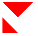
 1<!DOCTYPE html>
 2<html>
 3<head>
 4	<meta charset="utf-8">
 5	<title>三角形的实现</title>
 6	<style type="text/css">
 7		.square{
 8			width: 0;
 9			height: 0;
10			border-top: 50px solid red;
11			border-right: 50px solid transparent;
12			border-bottom: 0 solid transparent;
13			border-left: 50px solid transparent;
14		}
15		.tim{
16			width: 0;
17   			height: 0;
18   			border-top:0 solid transparent;
19   			border-right:50px solid transparent;
20   			border-bottom:50px solid red;
21   			border-left:0 solid transparent;
22		}
23
24	</style>
25</head>
26<body>
27	<!-- 等边三角形 -->
28	<div class="square"></div>
29	<!-- 等腰三角形 -->
30	<div class="tim"></div>
31</body>
32</html>
圆的实现方式
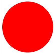
 1<!DOCTYPE html>
 2<html>
 3<head>
 4	<meta charset="utf-8">
 5	<title>圆的实现</title>
 6	<link rel="stylesheet" type="text/css" href="yuan.css">
 7	<style type="text/css">
 8		.circle{
 9			width: 200px;
10			height: 200px;
11			border:1px solid red;
12			border-radius: 50%;
13		}
14
15	</style>
16</head>
17<body>
18	<div class="circle" style="background:red;"></div>
19</body>
20</html>
样式引入方法
内联样式表
1<p style="background:red;font-size:15px"></p>
嵌入样式表
1		<head>
2         <title></title>
3         <style type="text/css">
4           p{
5             background-color:yellow;
6             font-size:xx-small;
7           }
8         </style>
9       </head>
外部样式表
在 head 标签里面写 link 标签引入外部 CSS 文件。
1<head>
2	<meta charset="utf-8">
3	<title>圆的实现</title>
4	<link rel="stylesheet" type="text/css" href="yuan.css">
5</head>
练习
编写时移动端页面时加入这行信息配置:<meta name="viewport" content="width=device-width, initial-scale=1.0, user-scalable=0, minimum-scale=1.0, maximum-scale=1.0" />
以上这行信息配置作用如下:
1* width=device-width--宽度为设备宽度,如果你的页面宽度小于设备宽度,就需要修改一下这个属性,不然的话会出现可以页面左右滑动,如ipad ios7中客户端页面。
2* initial-scale - 初始的缩放比例
3* minimum-scale - 允许用户缩放到的最小比例
4* maximum-scale - 允许用户缩放到的最大比例
5* user-scalable - 用户是否可以手动缩放
  1<!DOCTYPE html>
  2<html>
  3<head>
  4	<title>我的第一个项目实战页面</title>
  5	<meta charset="utf-8">
  6	<meta name="viewport" content="width=device-width, initial-scale=1.0, user-scalable=0, minimum-scale=1.0, maximum-scale=1.0" />
  7	<style type="text/css">
  8		*{
  9			margin:0;
 10			padding: 0;
 11		}
 12		li{
 13			list-style: none;
 14		}
 15		body{
 16			background: #f6f6f6;
 17		}
 18		.header{
 19			position: fixed;
 20			top: 0;
 21			left: 0;
 22			width: 100%;
 23			height: 50px;
 24			line-height: 50px;
 25			background: #fff;
 26			padding-left: 5%;
 27		}
 28		.header img{
 29			vertical-align: middle;
 30		}
 31		.logo{
 32			width: 82px;
 33			height: 24px;
 34			margin-right: 45%;
 35		}
 36		.search,.userimg{
 37			width: 24px;
 38			height: 24px;
 39			margin-left: 10px;
 40		}
 41		.bannerwrap{
 42			margin-top: 50px;
 43		}
 44		.bannerwrap img{
 45			width: 100%;
 46		}
 47		.classifywrap{
 48			margin-top: 10px;
 49			background: #fff;
 50			padding-bottom: 5px;
 51		}
 52		.classify{
 53			overflow: hidden;
 54		}
 55		.classify li{
 56			float: left;
 57			width: 25%;
 58			text-align: center;
 59		}
 60		.classify .list{
 61			color: #7e8c8d;
 62		}
 63		.classify .icon{
 64			display: inline-block;
 65			width: 50px;
 66			height: 50px;
 67			line-height: 50px;
 68			text-align: center;
 69			border-radius: 50%;
 70			background: #4a95dc;
 71			font-size: 18px;
 72			color: #fff;
 73			margin: 10px 0;
 74		}
 75		.coursewrap{
 76			width: 100%;
 77			background: #fff;
 78			padding: 0 5%;
 79			box-sizing: border-box;
 80			margin: 10px 0;
 81		}
 82		.hotwrap{
 83			height: 50px;
 84			line-height: 50px;
 85		}
 86		.hotwrap img{
 87			width: 25px;
 88			height: 25px;
 89			vertical-align: text-bottom;
 90		}
 91		.courselist{
 92			overflow: hidden;
 93			margin-bottom: 92px;
 94		}
 95		.courselist li{
 96			float: left;
 97			width: 48%;
 98			margin-bottom:10px;
 99		}
100		.courseposter{
101			width: 100%;
102			height: 120px;
103		}
104		.courseposter img{
105			width: 100%;
106			height: 100%;
107			border-radius: 5px;
108		}
109		.coursetitle{
110			font-size: 13px;
111			color: #333;
112			margin-top: 5px;
113		}
114		.levelprice{
115			overflow: hidden;
116			margin-top: 5px;
117		}
118		.level{
119			float: left;
120			font-size: 12px;
121			color: #333;
122		}
123		.price{
124			float: right;
125			color: red;
126			font-size: 13px;
127		}
128		/*设置商品的基数行li*/
129		.courselist li:nth-of-type(odd){
130			margin-right: 4%;
131		}
132		#bottomnav{
133			position: fixed;
134			bottom: 0;
135			left: 0;
136			width: 100%;
137		}
138		.nav{
139			width: 100%;
140			height: 100%;
141			border-radius: 50%;
142		}
143	</style>
144</head>
145<body>
146	<!-- 页面头部 -->
147	<div class="header">
148		<img class="logo" src="./img/logo.png">
149		<img class="search" src="./img/search.png">
150		<img class="userimg" src="./img/userimg.png">
151	</div>
152	<!-- 轮播图 -->
153	<div class="bannerwrap">
154		<img src="./img/banner.jpeg">
155	</div>
156	<!-- 分类 -->
157	<div class="classifywrap">
158		<ul class="classify">
159			<li>
160				<div class="icon">后</div>
161				<p class="list">后端</p>
162			</li>
163			<li>
164				<div class="icon">前</div>
165				<p class="list">前端</p>
166			</li>
167			<li>
168				<div class="icon">测</div>
169				<p class="list">测试</p>
170			</li>
171			<li>
172				<div class="icon">维</div>
173				<p class="list">运维</p>
174			</li>
175		</ul>
176	</div>
177	<!-- 课程模块 -->
178	<div class="coursewrap">
179		<div class="hotwrap">
180			<img src="./img/hot.png">
181			热门视频
182		</div>
183		<ul class="courselist">
184			<li>
185				<div class="courseposter">
186					<img src="./img/1.png">
187				</div>
188				<p class="coursetitle">Spring Boot 2.x零基础入门到高级实战教程</p>
189				<div class="levelprice">
190					<p class="level">级别:中级</p>
191					<p class="price">价钱:$29.8</p>
192				</div>
193			</li>
194			<li>
195				<div class="courseposter">
196					<img src="./img/2.png">
197				</div>
198				<p class="coursetitle">vue2019全新单页面应用仿京东电商项目</p>
199				<div class="levelprice">
200					<p class="level">级别:中级</p>
201					<p class="price">价钱:$39.8</p>
202				</div>
203			</li>
204			<li>
205				<div class="courseposter">
206					<img src="./img/2.png">
207				</div>
208				<p class="coursetitle">vue2019全新单页面应用仿京东电商项目</p>
209				<div class="levelprice">
210					<p class="level">级别:中级</p>
211					<p class="price">价钱:$29.8</p>
212				</div>
213			</li>
214			<li>
215				<div class="courseposter">
216					<img src="./img/1.png">
217				</div>
218				<p class="coursetitle">Spring Boot 2.x零基础入门到高级实战教程</p>
219				<div class="levelprice">
220					<p class="level">级别:中级</p>
221					<p class="price">价钱:$29.8</p>
222				</div>
223			</li>
224		</ul>
225	</div>
226	<!-- 底部导航 -->
227	<div class="classifywrap" id="bottomnav">
228		<ul class="classify">
229			<li>
230				<div class="icon"><img class="nav" src="./img/1.png"></div>
231				<p class="list">首页</p>
232			</li>
233			<li>
234				<div class="icon"><img class="nav" src="./img/2.png"></div>
235				<p class="list">课程</p>
236			</li>
237			<li>
238				<div class="icon"><img class="nav" src="./img/1.png"></div>
239				<p class="list">购物车</p>
240			</li>
241			<li>
242				<div class="icon"><img class="nav" src="./img/2.png"></div>
243				<p class="list">我的</p>
244			</li>
245		</ul>
246	</div>
247
248</body>
249</html>